


.jpg)
.jpg)
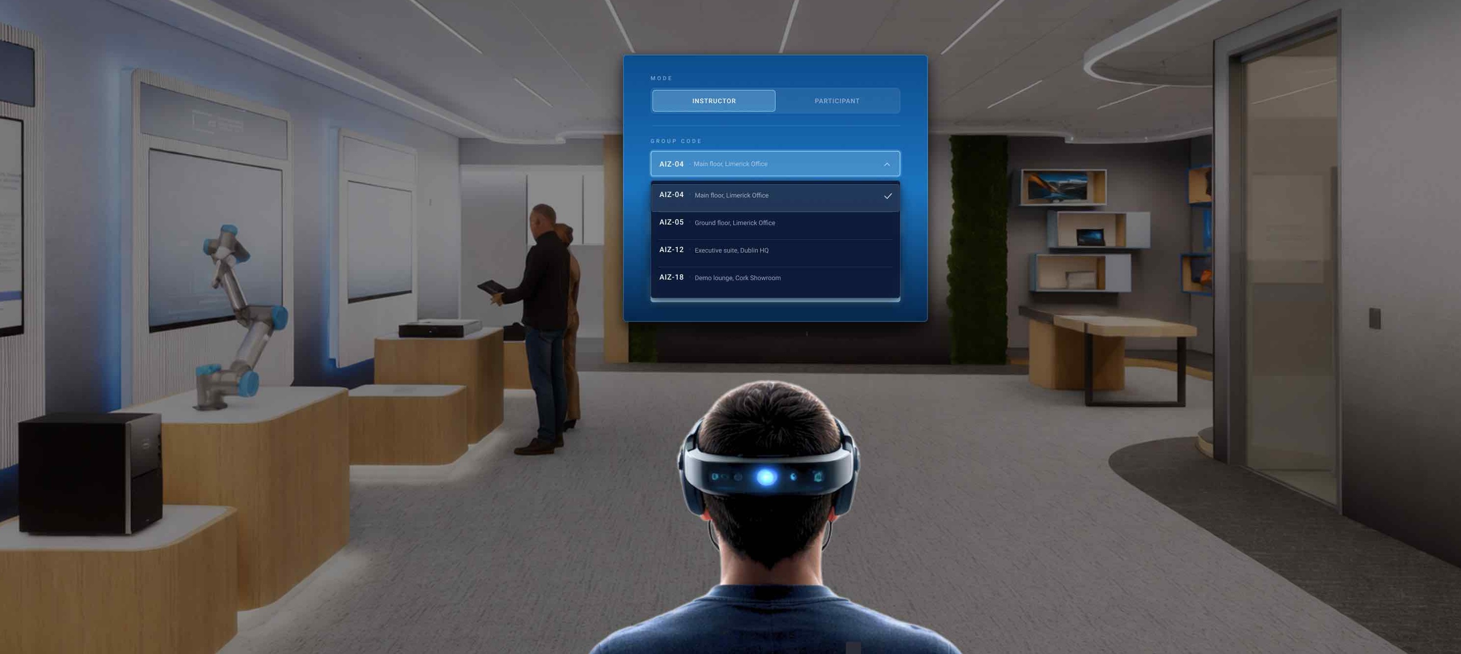
Dell Innovation Centres are where Dell brings its most important visitors, CEOs, city leaders, and heads of industry, to show them what's possible. My role here is Spatial XR UX Designer hired by Imvizar, their agency partner. I designed a flagship XR experience that walks these C-suite guests through building their own AI Factory on how raw data becomes intelligence, with the models that run on it, the infrastructure that powers it, and the ecosystem that ties it together.
My responsibility is to own the end-to-end spatial UX: spatial architecture design , in-headset UX UI, and multi-user interaction. built in collaboration with a 3D artist, a narrative artist, Sound Engineer and an XR developer. What makes it different from most XR work: it's instructor-led and multi-user (up to three guests in headsets at once), and it's anchored to the physical space: the centres have real hardware on display, including a physical AI server, and the experience connects to that environment instead of floating in a void.
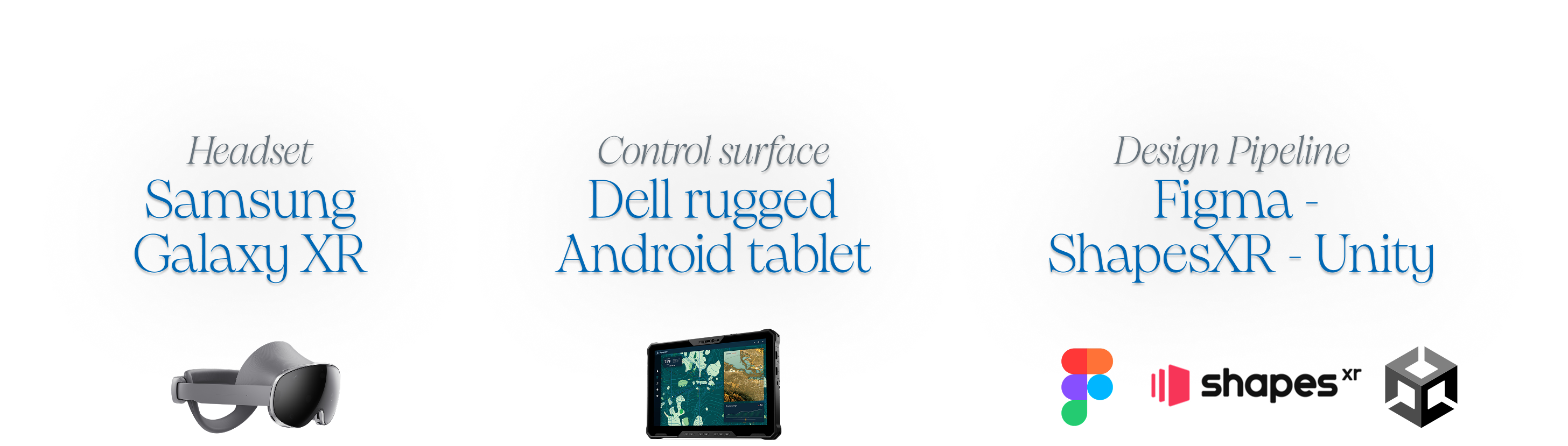
Tech Stack i use in this project : Unity 6, Figma , ShapesXR , ElevanLab, Meshy 3D.
Spatial Design
This isn't a fixed installation only deployed in one centre, it will be deployed across two innovation centres in Limerick , Ireland & Round Rock, Texas, and possibly event floors later. So the layout couldn't be tuned to one room. It had to be designed to respect the space while also making sure we have everything for a good UX for zoning system: experience vs. non-experience walking zones, onboarding → UX → offboarding flow, all set to defined dimensions.
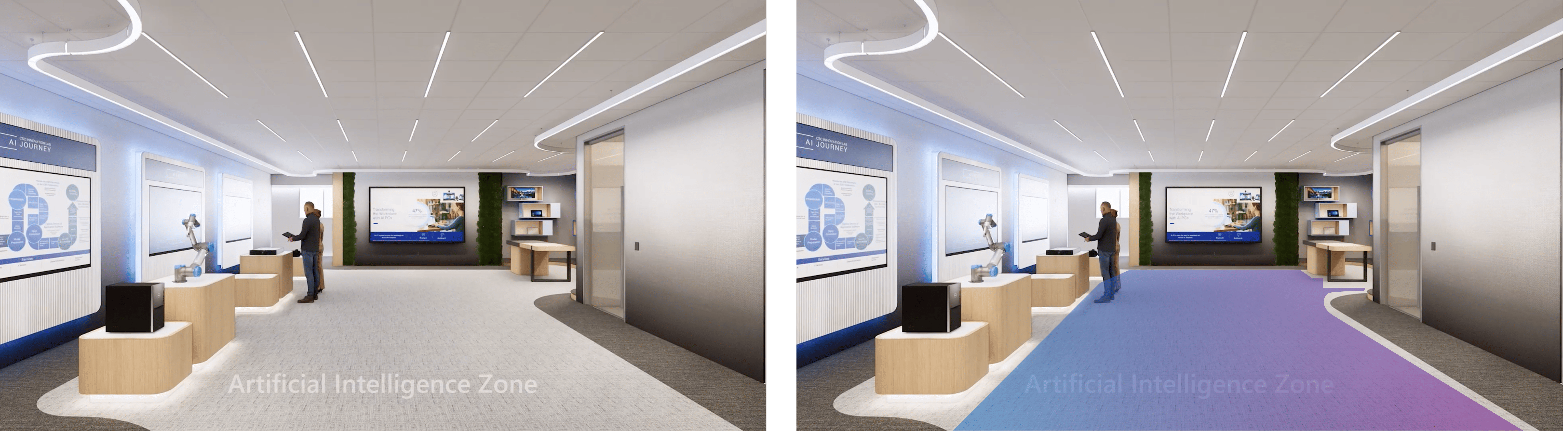
In a headset, your body, your attention, and what you're free to do all become the interface. So before I design anything, I plan the experience one moment at a time. based on my brief on the narratives, for each layer of story , I decide three things: what the person sees, when they see it, and why.
Spatial UX Framework i use :
The first thing to see if the the journey through the room: how someone is drawn in, guided through, and sent off and the most common one is to use the simple five-step model framework museums and exhibitions use to shape a visitor's arc from the doorway to the takeaway.

and then on second layer , because for the Dell AI Factory experience the guests were CEOs, they weren't only there to learn, they were there to be sold to. So each of the five moments had a second job: not just to guide the guest, but to move them toward a decision. So the journey is built around how a decision-maker actually buys: hook the desire, make the value land, kill the risk objection, then hand them the decision so it feels like their own.

Working with Space Blue Print :
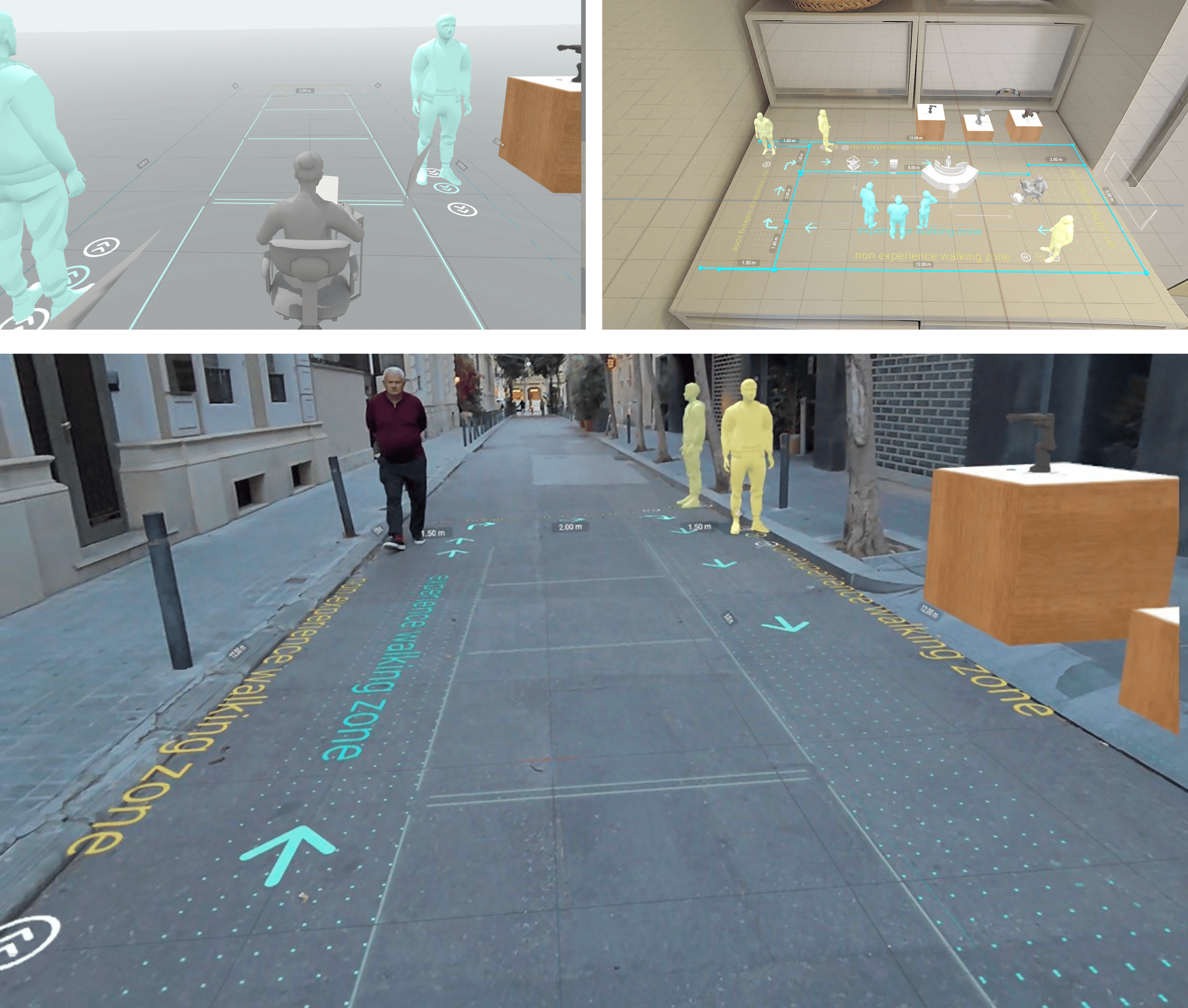
The first thing I did was rebuild the blueprint at real 1:1 scale in ShapesXR based on the floor plan we have. Walking the real footprint let me test the zones and clearances with my own body, catch what was too tight or too open, and confirm the sizing was right before a single asset existed. Everything after this, the zoning, the movement path, the pod placement, was built on scale I had already felt, not guessed. It also kept the design honest and reproducible, because it started from the real measurements of the space.
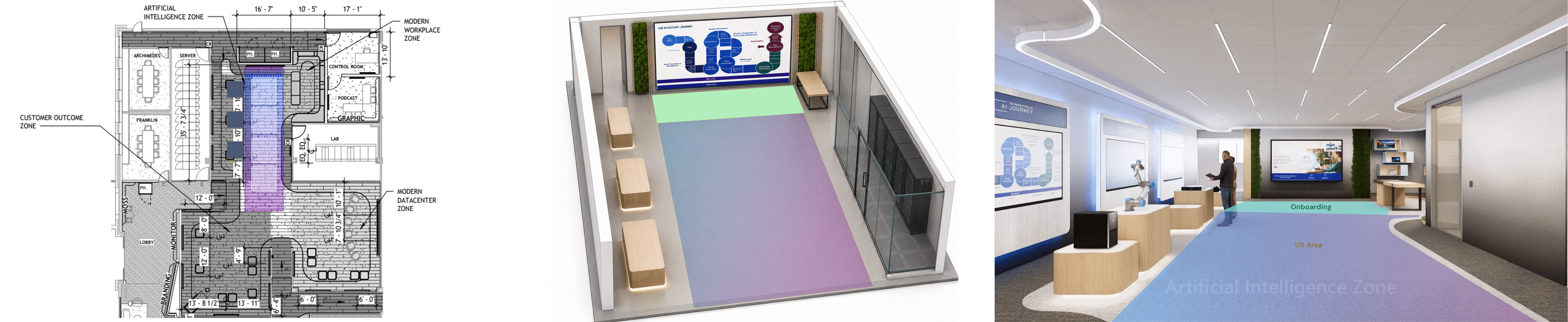
The user journey: The 5E set what user sees in the UX
Entice happen at the beginning of when user put on their headset, they willl see the whole map at a glance before deciding which content point they would like to go in.
Enter is the open floor, where the instructor walks the group through the introduction of what user are seeing
Engage is instructor walks the group through the core content experience
Exit and Extend bring them back toward the start for the close and the leave-behind.
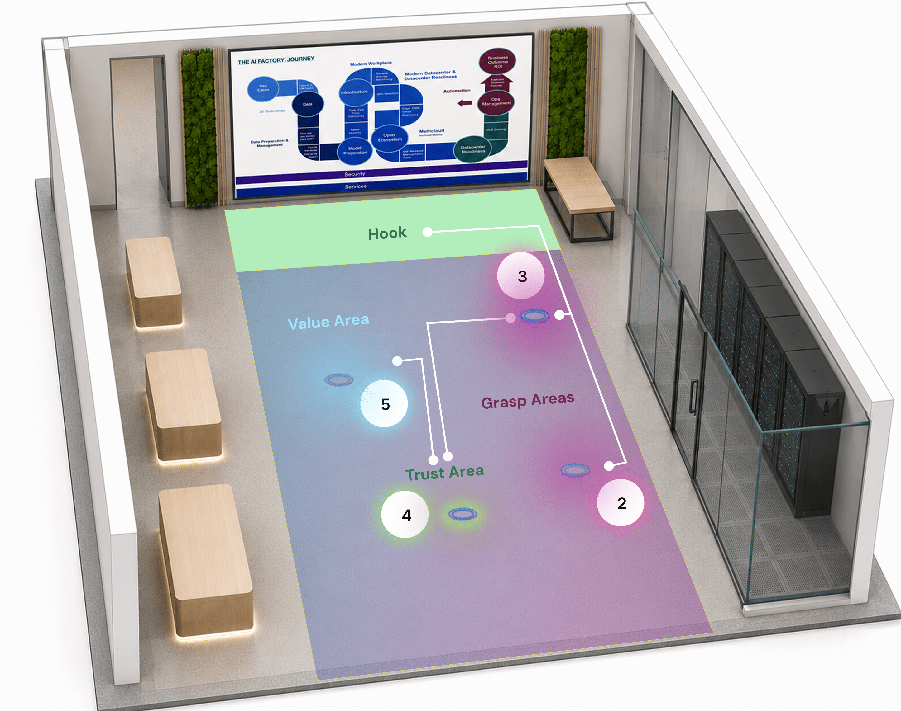
Design decision 1: A 2×4 block grid to place an entire AI architecture in a real room
The experience zone is roughly 12 m × 5 m, with 1.5 m walking buffers on the perimeter and an 8 m central corridor for circulation. Rather than eyeball placements, I proposed a 2×4 block system mapped onto the hall, giving every component a consistent, world-anchored home, with directional flow arrows routing guests forward on one side and looping them back on the other. It turned "where does this go?" from a per-asset debate into a repeatable grid, and gave the developer and 3D artist a shared coordinate language for spawning content.
Design decision 2: A POI-based system overview
I proposed an intro sequence that lays out the whole AI architecture as an overview module with a Point-of-Interest (POI) marker on each component This proposal is also to cater the Hook, Grasp, Trust and Value framework into the experience, giving each content point a clear home where its job can play out. Entice happens at the beginning, when the user puts on their headset: they see the whole map at a glance before deciding which content point they would like to go into.
Design decision 3: World-anchored objects, billboarded labels: "the user comes to the content"
An earlier approach arranged content on a 120° arc around the user's camera. With three simultaneous guests there's no single camera to arc around. So I shifted the model: 3D objects stay world-anchored in the centre and people move to them, while only the labels billboard to each guest's view. That's what makes a genuinely shared spatial experience work: everyone sees the same object in the same place and can point at it together.
XR UI UX Design
Once the spatial system decided where things sit in the room, the work moved inside each module: designing what people actually read, beat by beat. The narrative artist and the VFX artist shaped the assets , the 3D objects, the animation beats, the way data physically flows and resolves in the room. I designed the gaps between them. The labels, panels and readouts that tell you what you're looking at, the states that tell you where you are in the sequence, and the connective UI
My user interactions mode design thinking
Every headset can run as either Instructor or Audience. Deciding what each mode could do started with what each person wants to know.
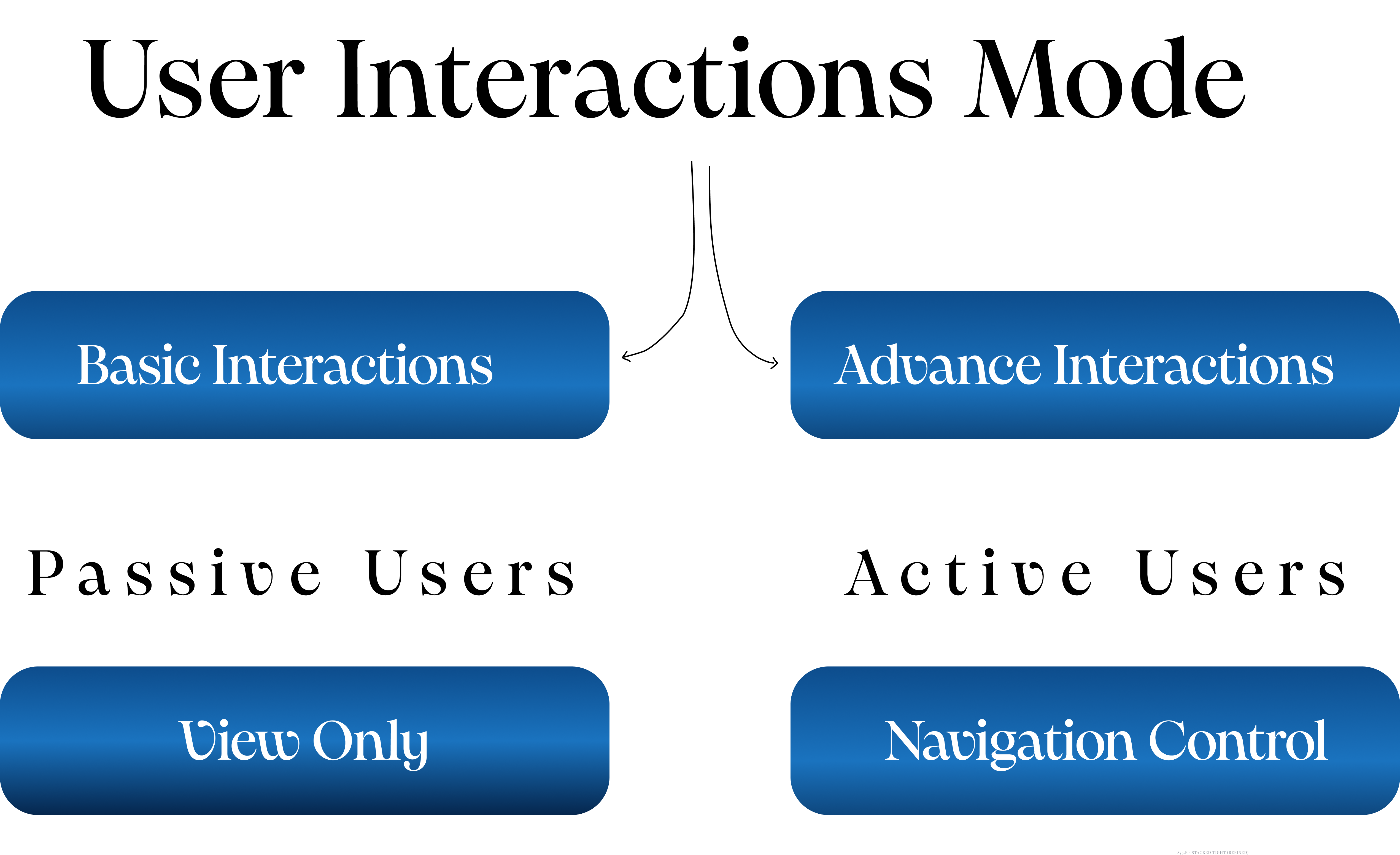
Audience mode = Basic Interactions
Read-only, read at distance, read by three people standing in different places. Closer to signage than to software. The audience never navigates.
Instructor mode = Advance Interactions
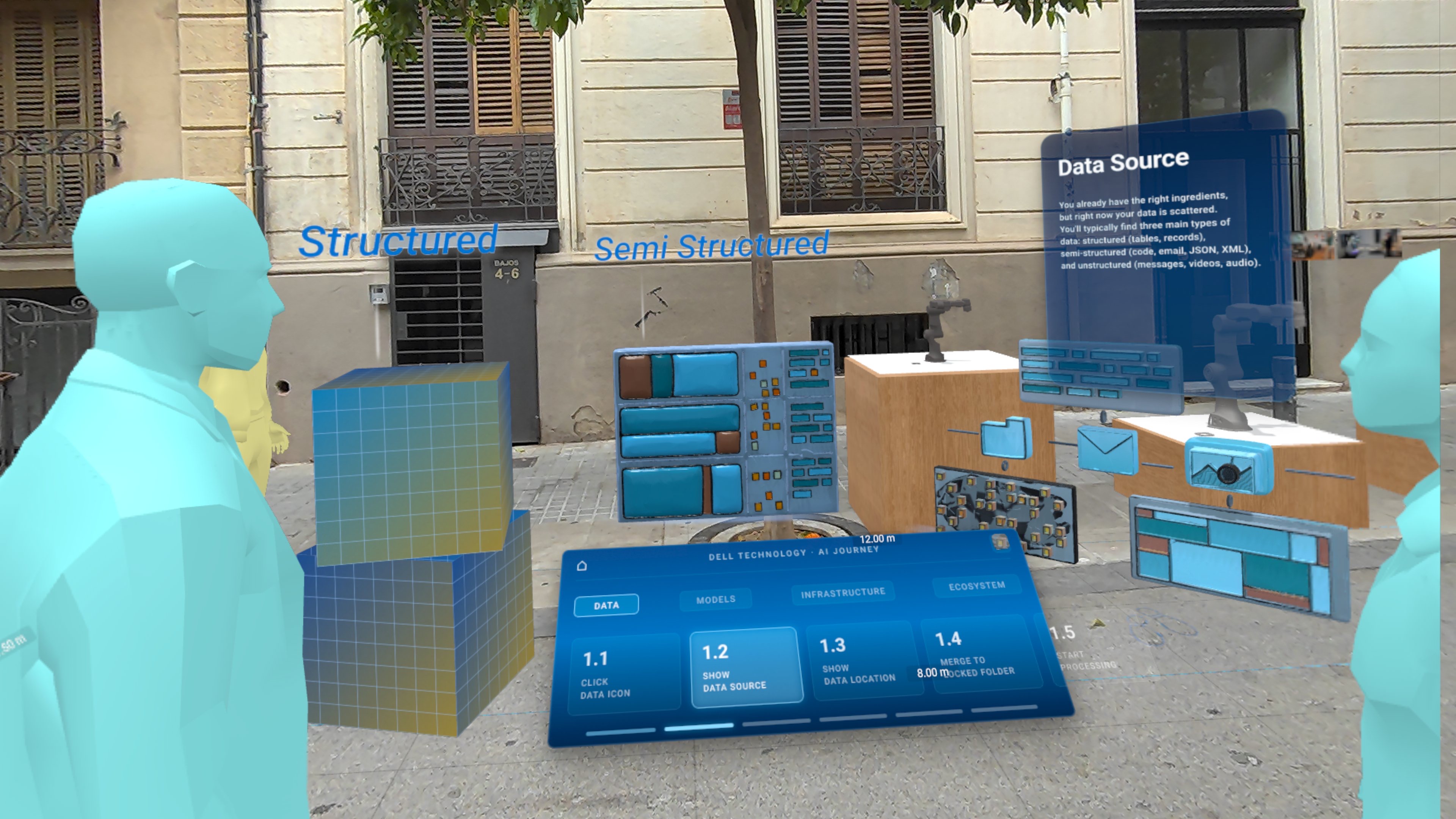
The navigation layer, and the only place in the experience where anyone drives anything. Direct touch, scene-to-scene control, state the instructor has to read at a glance while talking. Closer to a control room. This is where most of my UI work went.
Either mode, on any headset
The tablet is the primary console, but it can't be the only one. An instructor mid-room helping someone with a headset shouldn't have to walk back to a tablet to advance the story. So the in-headset Instructor mode also carries full scene-to-scene navigation: stepping manually forward and back through the beats of each POI module, the same control set the tablet offers.

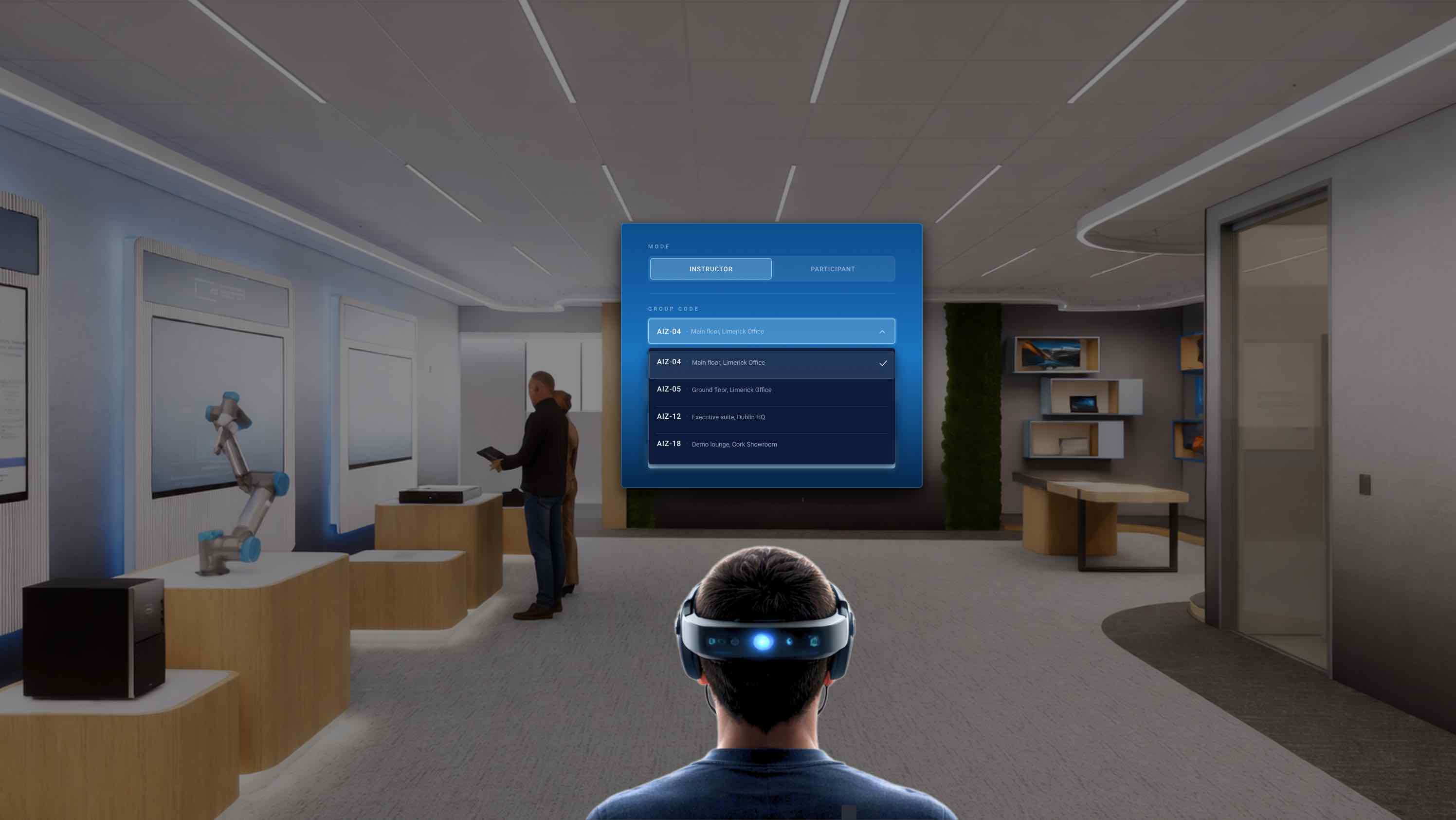
Design Decision on Instructor Mode UI
- World-locked and repositionable, not head-locked. Head-locked UI follows you into every moment you're trying to look past it.
- Chunky targets, one readable text band in the natural eye line. Buttons that feel generous on glass read too small in space.
- A bottom progress bar. It masks the lag between a control press and the animation starting. Without it, every spawn feels like a hesitation.
- Navigation UI . The instructor steps through beats in front of a live audience. Going back without dropping out of the module is what makes that feel controlled.


Collaboration with Sound Engineer
I also used the prototype as the source of truth for my collaboration with the sound engineer. I walked him through it scene by scene and module by module, showing how each component was supposed to appear in the room, so he could create the right sound effect for each one. The result was tactile, beautiful and surreal.
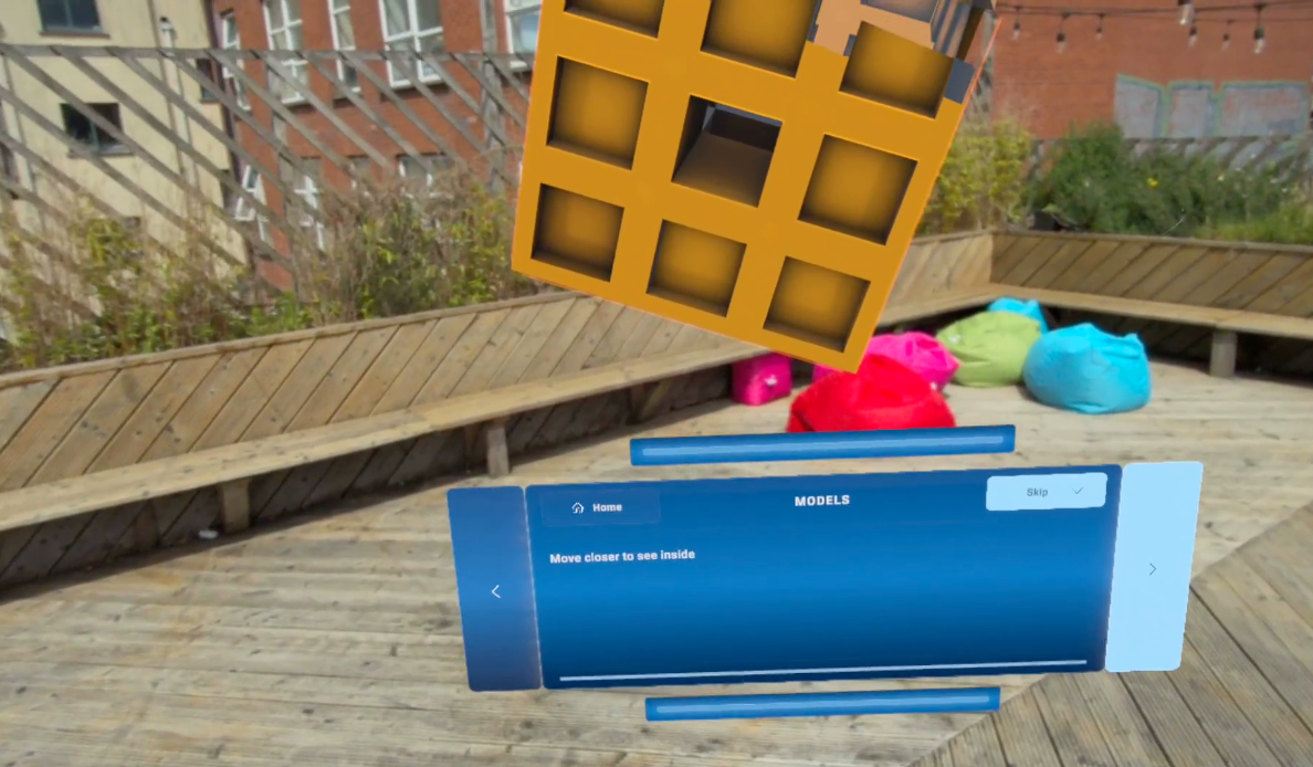
UI: delivered UITK-ready through the Figma converter
Designing into someone else's assets only works if your half arrives build-ready. That meant two delivery tracks, because the two asset types fail differently. Spatial assets fail silently at the wrong size. UI assets fail loudly, by needing to be rebuilt.
So I used my prototype from ShapesXR and exported real sizes and placements as Unity packages, with true dimensions baked into each object. From there it chained cleanly. The animation artist built objects at correct scale straight from the package, then passed them to the developer, who dropped them into his own package and built against accurate space from day one. Nobody had to chase a number.
On the UI side, panels went from Figma straight into Unity's UI Toolkit through the converter, so what I designed became the UI in engine rather than something the developer rebuilt by hand.


The experience shipped, and Dell called it
" the best demo they'd ever seen " , which for a room full of people who are notoriously hard to impress, meant a lot.
What I'd do differently
- Establish a "spatial truth" lock-point earlier in the pipeline, so revisions don't cascade through animation and dev.
- Keep designing for revision-tolerance: the POI overview worked precisely because it absorbed change instead of resisting it.
- Better delivery pipeline of text based assets in Unity , as the converter has it's own challenge that i too was learning from.
The final experience isn't included. It's under NDA and I'm protecting client privacy, so what you're seeing is the design process rather than the finished product: how I approached the problem, the decisions I made, and how I delivered the work.
Thank you for reading ❤️

.png)


.png)