


.jpg)
.jpg)
.png)
Maria, a first-time VR user, put on her headset, eager to explore. But within seconds, she was stuck. She instinctively tried to walk forward, but nothing happened.
- She didn’t know she needed to use the controller to move.
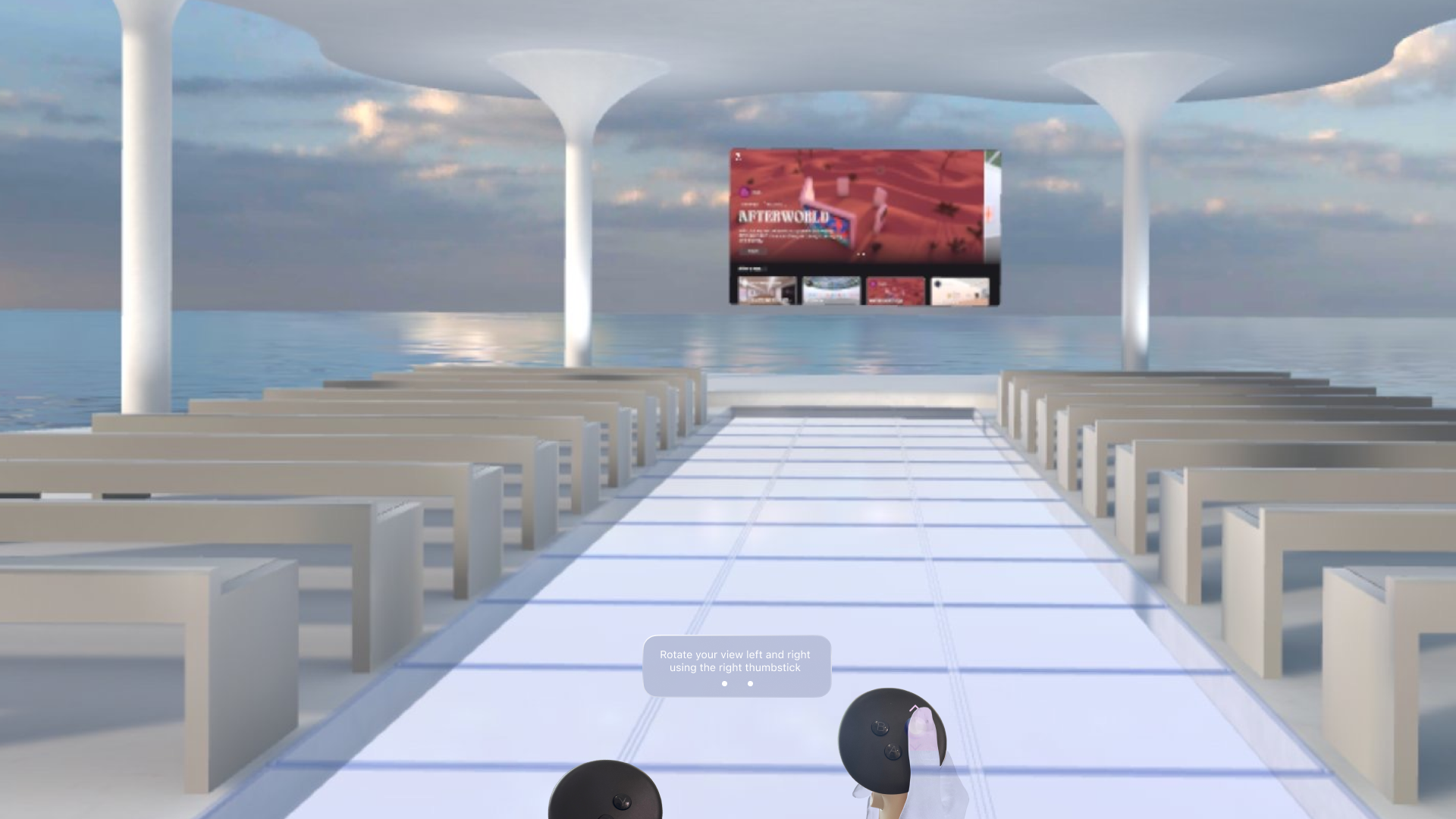
- She tried turning her head to rotate but didn’t realize the controller had rotation functionality.
- She saw other areas but had no idea how to teleport there.
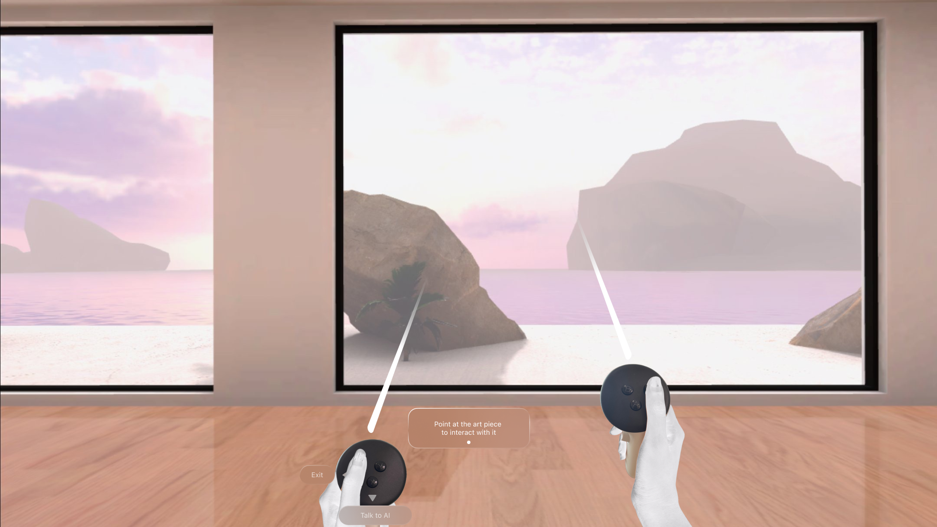
Instead of immersing herself in the art, Maria felt stranded. When James, another tester, reached the main panel, he hesitated. He saw options in front of him but didn’t know how to interact, he pressed buttons randomly, hoping something would happen and he mistakenly used the thumbstick up/down, assuming it would scroll like a webpage.
Instead of engaging with the museum’s content, Maria and James spent valuable minutes just figuring out what to do. This was the reality for many first-time users. They struggled with movement, navigating panels, and interacting with objects—basic actions that should have felt natural.
.png)
UX Psychology Insights from testing
The onboarding process failed because it didn’t align with natural user behavior. Three major cognitive barriers were at play:
- Cognitive Load – Users were overwhelmed by too much unstructured things at once, without focus point.
- Affordance & Signifiers – Lack of clear cues made it difficult for users to understand what actions were possible.
- Mental Models – Users applied their real-world expectations (like scrolling a panel as they would on a phone), leading to confusion when the system behaved differently.
A successful pre-VR experience ensures users can navigate and discover without needing external instructions. Key evaluation criteria:
- Intuitiveness – How difficult will it be for users to learn this method?
- Discoverability – How likely will users discover a feature, function, or action?
- Usability – How effective is this method in helping users achieve their goals?
The UX Science Behind the Redesign
As Atopia ( link to MetaQuest store ) is seeking to showcase the value of their minimal and intuitive product, we are adding guided onboarding that instead of static tutorials, the solution needed to be stitched into the user’s journey with signifiers and reinforced learning points to improve ease of interaction.
.png)
At the end of redesign, we should be able to answer the key evaluation criteria above.


I took an Apple-like approach—designing an experience that feels effortless, where learning happens naturally. The redesign was not just about adding tutorials but about making interaction intuitive from the start, to comprehend the true value of Atopia's products.
Step 1: Learning Movement Naturally
- Instead of overwhelming users with instructions, we introduced visual guides right when users needed them.
- A subtle ghosted movement trail now suggests where to go, for natural discovery.
- Teleport markers dynamically adjust based on gaze direction, reducing hesitation.


Step 2: Browsing & Interacting with Confidence
- Without limiting the user movement in guided onboarding, we introduced context-sensitive prompts that highlight interactive elements dynamically when user are facing certain angle and within certain proximity


Step 3: Bringing Objects to Life
- Users are gradually introduced to interactions in a step-by-step manner on proximity and needs, rather than all at once.


Final Implementation and Design Dev Hands Off
Approaching Onboarding with Dynamic Jobs to Be Done
Users don’t need a lengthy tutorial; they need guidance when they need it. The onboarding experience adapts dynamically to the user’s actions, providing step-by-step assistance only when required—ensuring minimal disruption and maximum engagement.
Handoff to Development
Once the design was approved, I created a Design-Dev Hands-Off document that mapped out every interaction—from onboarding to movement and panel browsing.
- Every UI element was documented with placement guides, expected behavior, and asset references, including hand animation models for a seamless developer handoff.
- Developers received ready-to-implement assets alongside clear specifications, eliminating unnecessary back-and-forth.
- The entire system was built for scalability, allowing future refinements without disrupting the experience.
The User Experience: Before & After
Maria, who once stood confuse at the entrance, now moves freely. James, who struggled with the panel, now browses —allowing users to focus on the experience, not the mechanics.
Thank you for reading ❤️

.png)


.png)