


.jpg)
.jpg)
INDYX is a digital wardrobe mobile application with a mission to unlock the potential of what you already own. More than just a virtual closet, INDYX aims to make mindful dressing fun again , helping people reconnect with their wardrobe and rediscover the pieces they already love. To support this goal, the Mixed Reality (MR) wardrobe experience is designed with the goal to make user feel close and fall in love with their wardrobe again. Connected to the mobile app, this MR experience allows users to upload their real-life wardrobe into a digital library, and explore outfit combinations effortlessly in an immersive environment.
Sharing my design process in designing this immersive experience , like all meaningful design journeys — with listening to real people, exploring their relationships with clothing, and translating those emotional insights into design principles.
Below i'm taking you through:
- XR Design thinking and research process
- Key features and interaction models in MR
- UI UX Design & Protoyping of the Eperience
.png)
Based on conversations and observations, we identified a few common patterns in how people relate to their wardrobes — patterns that often lead to frustration and overconsumption. Coming from an e-commerce background, I've seen firsthand how much effort goes into encouraging people to buy more — but what happens after they buy often remains unaddressed. Designing INDYX's Mixed Reality experience started with a simple but important question:"How might we help people fall in love and feel confident with what they already own?
A while ago, I took a Masterclass on XR Design by Cornel Hillmann, where he introduced the idea of finding an "Experience Sweet Spot" when designing for XR. In his class, he emphasized that great XR experiences emerge when we can align and balance three essential elements:
Human Needs – What real frustrations, desires, or motivations are we addressing?
Product Potential – What value can this product offer beyond existing tools or apps?
Interaction Possibilities – What interactions feel natural and magical in XR?
I applied this framework throughout my design process. While there are 6 things we can use from this diagram , the one that i find super useful for this project are the three in the image and here is how they translate into a sketch My goal was to find that sweet spot where technology, human emotion, and interaction design meet — creating an experience that feels natural, empowering, and beautiful to use.
.png)
1. Extend to Next Dimension
Sketch Translation:
- The wardrobe items from the mobile app are imagined as floating 3D pieces users can mix & match in their room.
- UI Designed to switch easily between Tops, Bottoms, Accessories easily.
- Gesture interaction for mixing pieces without wearing them.
2. Given the Nails, Find the Hammer
Sketch Translation:
- Floating panels with filtering chips for categories, showing wardrobe navigation.
- Includes thinking about color chips and sorting for smarter filtering
3. Given the Hammer, Find the Nails
Sketch Translation:
- User can see clothing items floating and being picked or dragged into the mix & match area
- Use gesture interaction for selecting and moving wardrobe pieces
- Also tied to AI Feedback (future AI styling suggestions that react to user’s pick) as confidence servant layers into their choice


After defining the design principles and identifying user needs, I mapped out the user journey to understand how people would interact with their wardrobe in MR — from onboarding to creating and sharing outfits.
.png)
Translating Mobile to Spatial UX
INDYX originally started as a mobile application , a digital wardrobe where users upload and manage their real-life clothing, create outfits, and plan looks. But when designing for Apple Vision Pro , I started by analyzing what core features users rely on in the mobile app — like browsing items, creating outfits, and seeking AI-generated styling suggestions to keeps that same focus on helping people rediscover and re-love their wardrobe but elevates it into an immersive experience
.png)
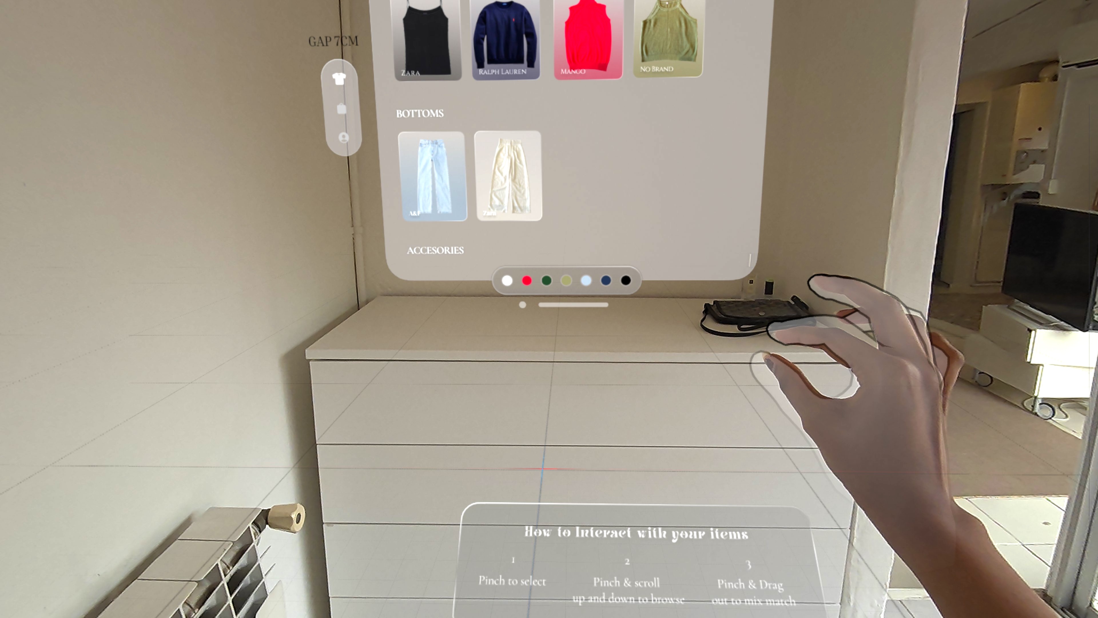
With these , now I was ready to craft their UI/UX language and interaction flows for spatial envoronment. The design process starts by mapping out which UI components belong to each scene, and how they should behave in space. To do this, I structured the design using key technical parameters: UI Component, Interaction Type, Distance from User, Field of View (FOV) Region and Behavior & Animation . All of these were first planned and documented in Figma, allowing me to clearly define the spatial logic and flow of the experience before moving into prototyping.Once mapped out, I prototyped each element one by one to validate real-world sizing and spatial feel, using ShapesXR.
.png)
High Fidelity UI UX Design
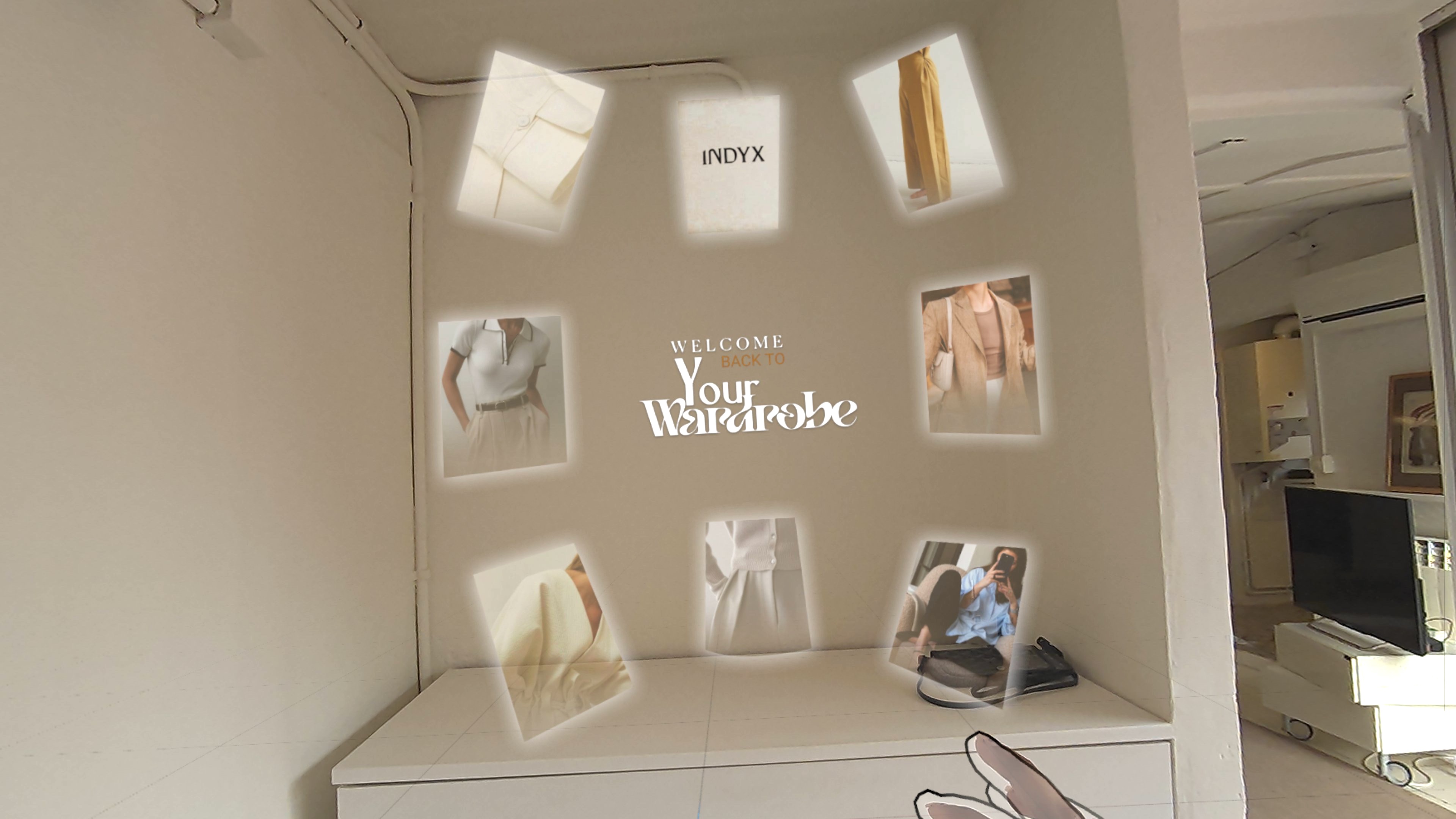
Onboarding & Enter Wardrobe
.png)
.jpg)

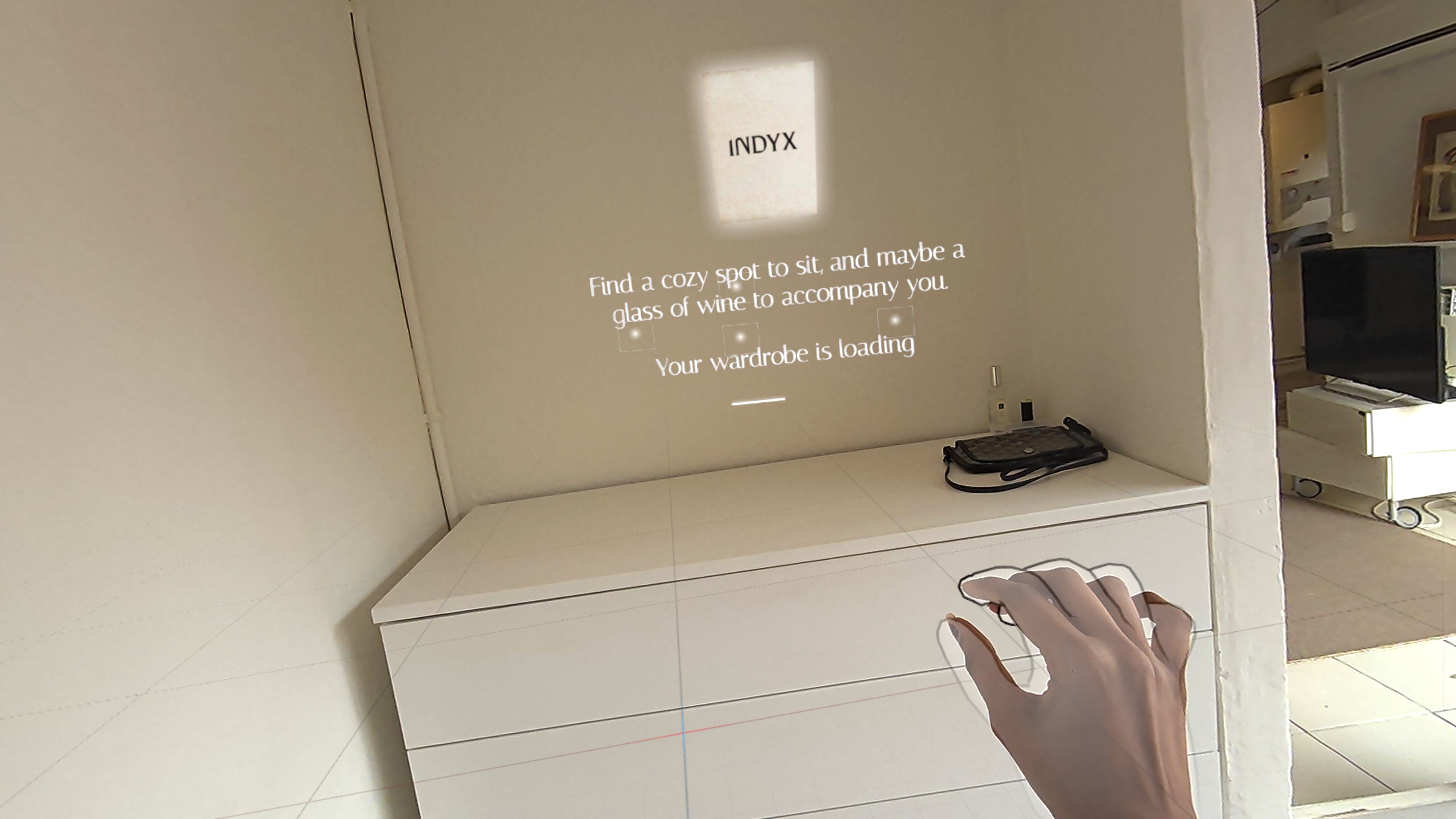
Wardrobe Loading & Orientation

.png)


.png)